Who’s Reading James Patterson in Seattle? A Tableau Project.
#MakeoverMonday 2019 Week 37
This project is based on the popular #MakeoverMonday data initiative run by Tableau Zen Master, Andy Kriebel, and Eva Murray, Head of Business Intelligence at Exasol. Each week they provide an article that contains a data visualization and data set. Participants are able to look at the data set and see if they can come up with a better story, a different story by redesigning the chart using Tableau.
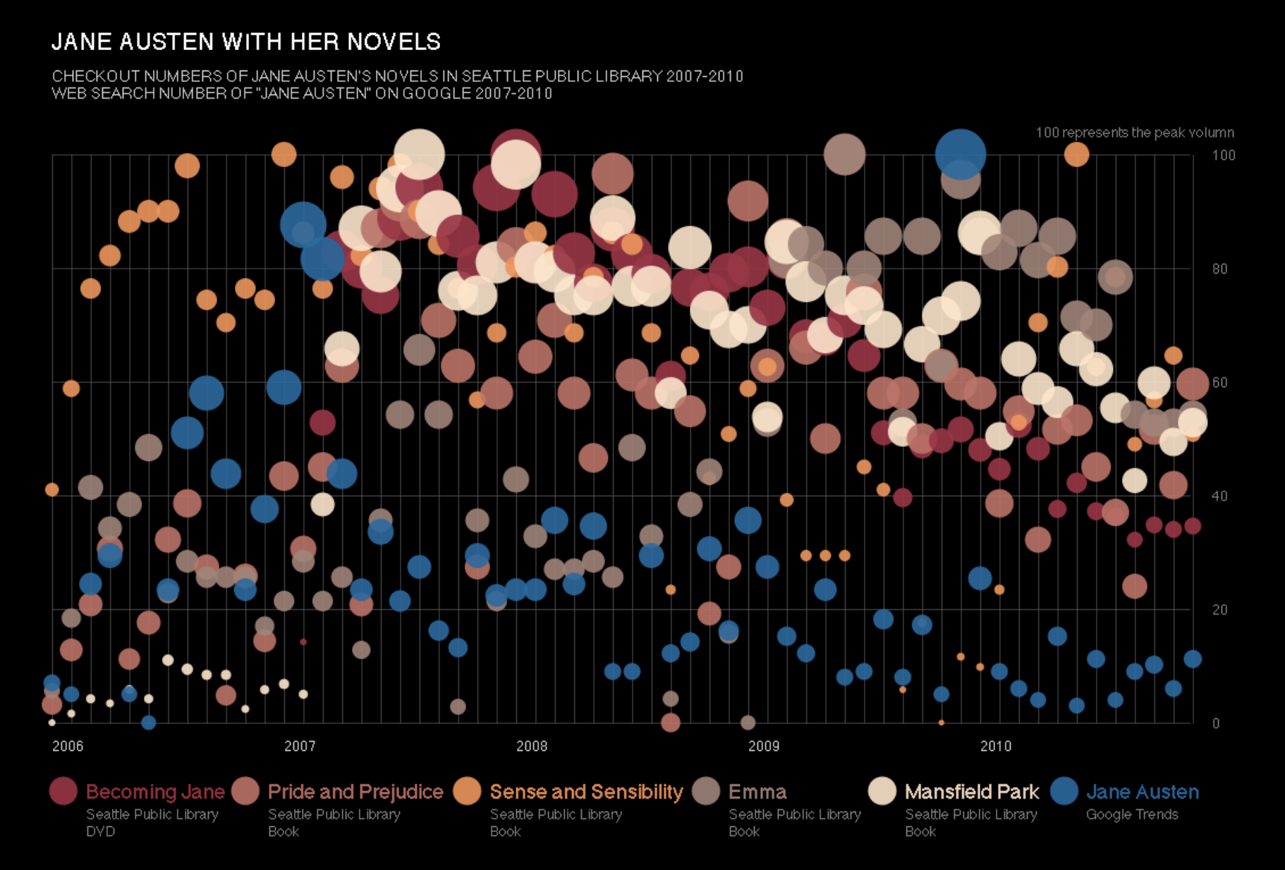
First, a look at the original visualization based on Jane Austen’s novels.

The Pros
- Good use of a black background with multiples colors of data bubbles showing different books.
The Cons
- The chart’s year starts at 2006 but the subtitle says 2007 to 2010
- Author doesn’t make clear that he is trying to see if there’s a connection between Google Searches of Jane Austen and the subsequent checkout of her books at the library
- Hard to tell which books are Austen’s most popular checkouts in comparison to the others
Second, the data set and the wrangling.
The data, which comes from Seattle’s Open Data website, concerns the Seattle Public Library and the number of monthly checkout of James Patterson books. The data set is also downloadable at data.world.
Crime and blood are not scenes that regularly make up my reading repertoire, yet a week ago those physical disturbances did come up when I read Toni Morrison’s Song of Solomon. Though not as gory as Mr Patterson’s work I’m sure.
There are some data discrepancies in the column titled publication year. The years were entered in various formats that included brackets and copyright symbols. We only want dates from 1996 to 2019, a total of 23 unique years instead of 65. So let’s clean that up. I’m going to upload the data set into Jupyter notebook and use the pandas library to make the dates consistent.
THE RESULT: Jupyter Notebook
Finally, let’s make the data visualization, the fun part!
For every Makeover Monday project, my objective for now, as a newcomer still, will be to imitate someone else’s Tableau visualization. The reason for this is simple: you learn by imitation, and you will learn how to do things you haven’t seen done before. I always learn something new from re-creating and tweaking someone else’s data visualization.
What trend can be spotted in this data set? If you hover on the years column, you will see that 3 to 5 years after the publication of each of Mr Patterson’s books, people tend to checkout them out less often.
THE DATA VIZ:
